
4 Common Paint Colour Mistakes You Should Try to Avoid
January 24, 2017
Choosing a paint colour sounds simple until you are standing in front of a wall of swatches trying to picture how a shade will actually look once it covers an entire room. A colour that looks perfect on a small chip can feel completely different across four walls, under different lighting, and alongside your existing furniture.
Many homeowners take on a repaint themselves, particularly when the weather is favourable and there is time to tackle a weekend project. Preparation is genuinely half the job, and that includes preparing the right gear, prepping the surface properly and, just as importantly, choosing a colour palette that will still look right long after the paint has dried.
Colour mistakes are some of the most common and most avoidable problems in a residential painting project. Here are four mistakes worth watching for, and how to avoid them before you commit to a colour.
1. Not Thinking About the Atmosphere You Want to Create
Paint colour does far more than decorate a wall. It plays a significant role in how a room feels to be in, and that feeling should guide your choice just as much as personal taste.
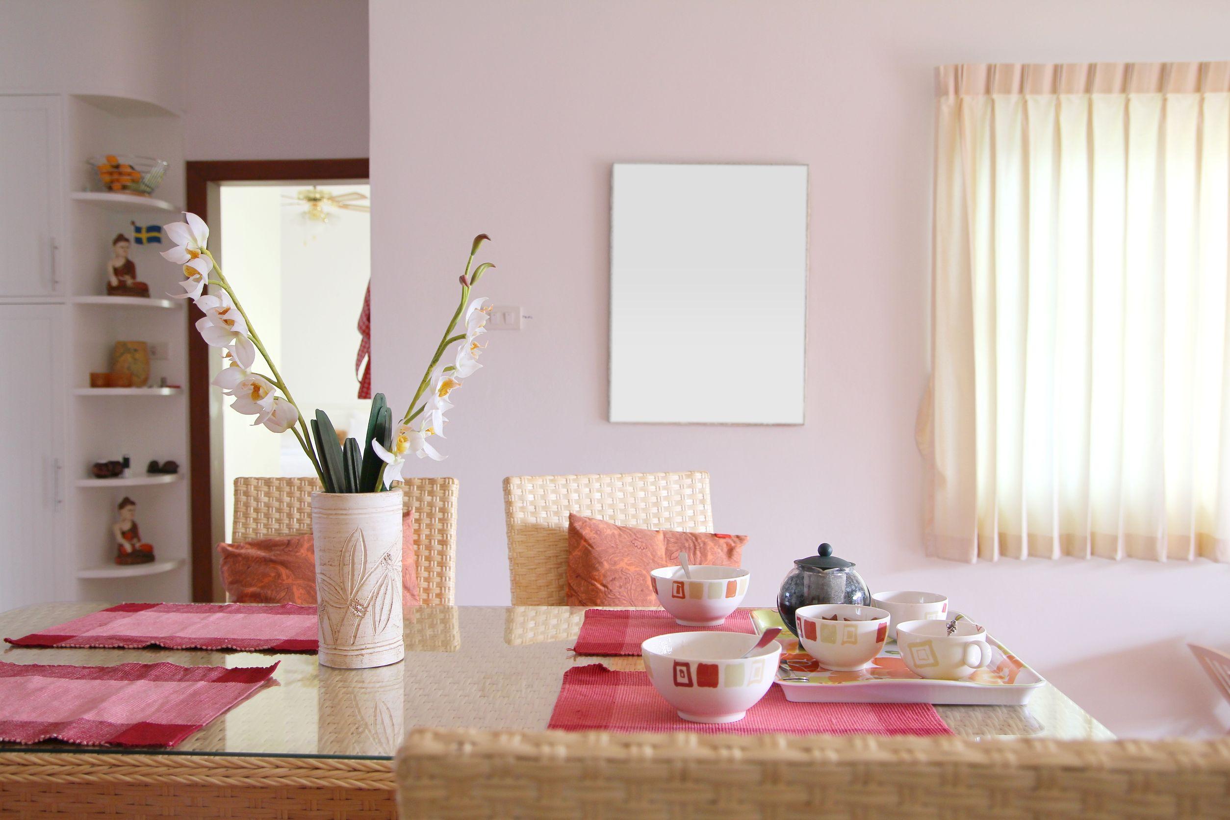
A colour that works beautifully in one room can feel completely wrong in another because each space in the home tends to serve a different purpose. Bathrooms often suit lighter, calming tones such as soft blues, creams or gentle yellows, which can help a small, functional space feel fresh and clean. Living rooms, on the other hand, are usually where people want to relax and unwind, so slightly deeper, warmer shades can help create a more comfortable, inviting atmosphere.
Before deciding on a colour, think about how the room is used, how much natural light it receives throughout the day, and how the shade will sit alongside existing furniture and flooring. A colour chosen purely because it looked appealing in a showroom or on a screen can easily clash with the mood you are trying to create at home.
2. Using More Colours Than Is Optimal

It is tempting to introduce several different colours into one room, especially when there are a few shades you like and cannot decide between. In practice, using too many colours in a single space often works against you.
As a general guide, most rooms look their best with no more than three or four colours across walls, trims, ceilings and any feature elements. Go beyond that and a room can quickly start to feel cluttered, busy and visually uncomfortable rather than considered and well designed.
There are exceptions, particularly in playful spaces such as a child’s bedroom or a feature area designed to stand out. But as a starting point, restraint tends to produce a more polished result. If you like the idea of a bold moment without overwhelming the whole room, consider our guide to feature wall colour ideas for inspiration on introducing colour in a more controlled way.
3. Choosing Colours That Do Not Suit the Space

Another common mistake is combining colours that have not been tested together, simply because each one is appealing on its own. Two attractive shades do not automatically make an attractive pairing once they are on opposite walls or beside one another in the same room.
Rather than guessing, it helps to research colour palettes that are already known to work well together, or to speak with a paint retailer or professional painter who can suggest combinations suited to your space. Considering the room’s size can also help. If you are working with a smaller room, our guide on the best paint colours for small rooms can help you avoid shades that make a space feel more cramped than it needs to.
4. Going Too Bold or Too Harsh
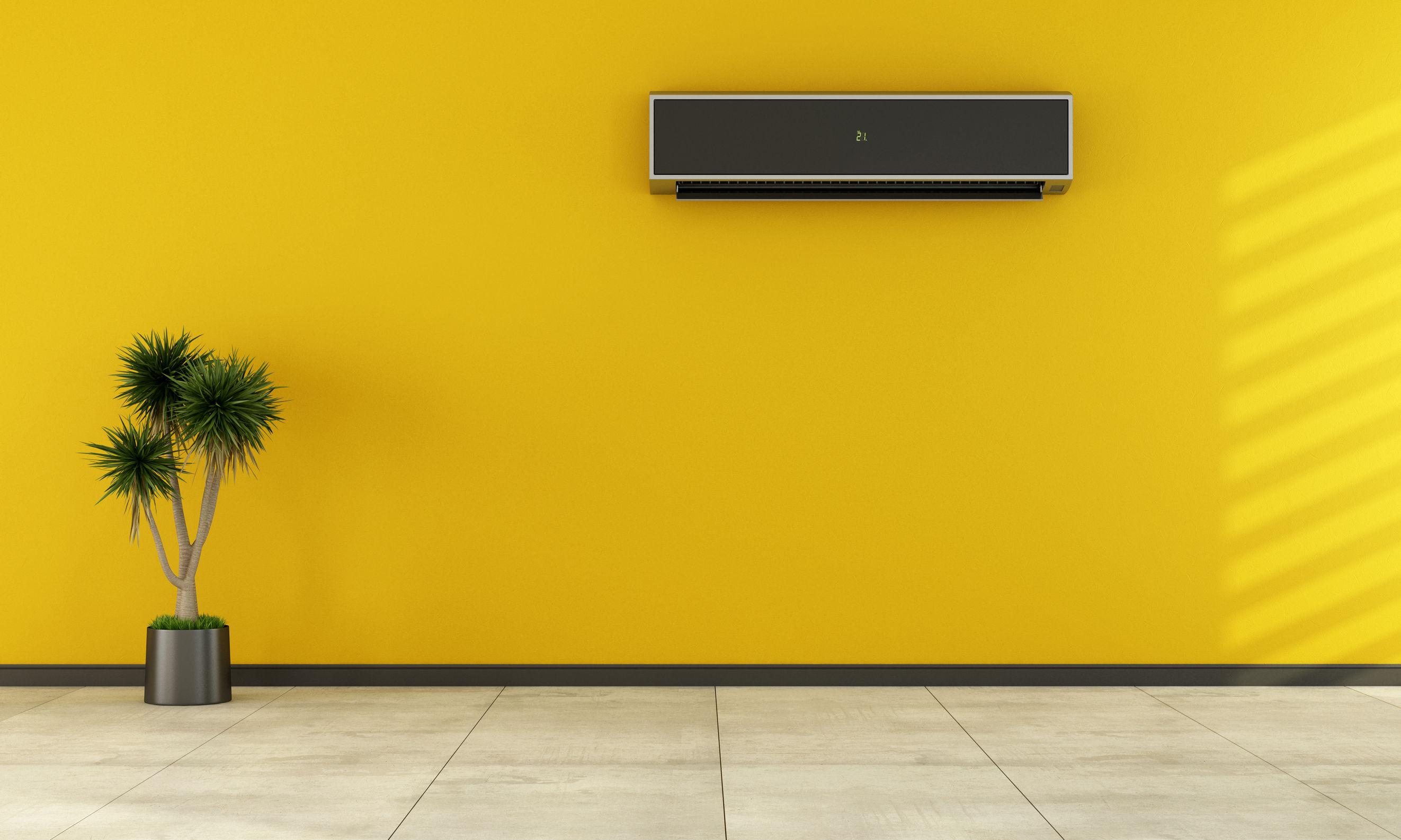
Bright, saturated colours can be a great way to add personality to a home, but used without balance they can quickly become overwhelming. A room painted entirely in a vivid, high contrast colour can start to feel chaotic, and in some cases even cause eye strain when you spend extended periods of time in the space.
The solution is not to avoid bold colour altogether, but to balance it. Pairing a bold shade with neutral tones on surrounding walls, trims or furnishings allows the colour to stand out as a feature rather than dominating the entire room. If you are working with a darker room and want to avoid it feeling heavy or closed in, our article on the best paint colours for dark rooms covers some useful options.
Getting Colour Selection Right the First Time
Colour choice is one of the more personal parts of any painting project, but it does not have to be guesswork. Testing swatches on the actual wall, viewing them at different times of day, and comparing them against furniture and flooring already in the room can prevent a lot of disappointment further down the track.
If you are still unsure, it is worth speaking with an experienced painter or colour consultant before committing to a full repaint. A professional eye can quickly spot whether a colour will work in your specific space, saving you the cost and effort of repainting a second time. If you would like help matching an existing colour or finding the right shade for your next project, our guide on how to colour match your paint is a good place to start.
Frequently Asked Questions About Choosing Paint Colours
How many colours should I use in one room?
Most rooms look best with three to four colours across the walls, trims, ceiling and any feature elements. Using more than this can make a room feel cluttered rather than considered.
How do I know if a colour will suit my room?
Consider the room’s purpose, the amount of natural light it receives, and how the colour will look alongside existing furniture and flooring. Testing a sample directly on the wall and viewing it at different times of day is the most reliable way to check.
Can I use bold or bright colours in my home?
Yes, bold colours can work well when balanced with neutral tones elsewhere in the room. Using a bold shade as a feature rather than throughout the whole space usually produces a better result.
Should I hire a professional to help choose a paint colour?
It is not essential, but a professional painter or colour consultant can help you avoid costly mistakes, particularly for larger rooms or whole-home projects where getting the colour wrong is more expensive to fix.
Get Expert Colour Advice From Priority One Coatings
Choosing the right paint colour is easier with the right support. Priority One Coatings has been providing professional painting solutions since 1988, helping Sydney homeowners select colours that suit their space and stand the test of time.
If you are planning a repaint and want guidance on colour selection, preparation or the finished result, contact Priority One Coatings today to discuss your project and request a quote.